

How to Identify Bold Streetwear Designs That Actually Stand Out
Table of Contents
- What Makes a Bold Streetwear Design Work
- The Difference Between Loud and Intentional
- How Bold Graphics Shape Silhouette and Proportion
- How to Choose Typography for Streetwear That Hits Hard
- Color Palette and Print Method: The Technical Side of Bold
- Identifying Authentic Streetwear Quality in Person
- Streetwear Graphic Design Trends 2026: What to Watch
- Cultural Influences and Subculture Signals in Bold Design
- Conclusion
- Frequently Asked Questions
Last Updated: September 16, 2026
What Makes a Bold Streetwear Design Work
Bold streetwear uses scale, contrast, and cultural reference to make a garment readable from across a room. The strongest pieces aren't just loud, they're intentional: every oversized graphic and color choice serves the silhouette it sits on.
The Difference Between Loud and Intentional
Loud design shouts. Intentional design speaks.
The difference shows up in hierarchy. A loud piece stacks competing elements, five fonts, three colors, a photo, a slogan, all fighting for the same square inch. An intentional piece picks one hero element and supports it: a single oversized back print, a puff-print seal, or one line of graffiti lettering.

How Bold Graphics Shape Silhouette and Proportion
Bold graphics change how a body reads before anyone processes the words. A large back print widens the upper torso visually, which is why oversized fits pair with big graphics. A small chest hit keeps the silhouette clean and lets the cut do the talking.
Placement rules that hold up in practice:
- Full back prints work best on relaxed and oversized fits
- Front-only graphics need a tighter, more structured cut to stay sharp
- Vertical lettering elongates; horizontal blocks widen
- High placement (upper chest) draws the eye up; low placement grounds the piece
How to Choose Typography for Streetwear That Hits Hard
Typography is the fastest way to signal whether a design belongs in streetwear or on a corporate giveaway. Pick one typeface family, then push its weight, spacing, and scale.
Block Letters, Wild Style, and Visual Hierarchy
Block letters are the workhorse: heavy, geometric, legible at distance, carrying slogans and brand names without decoration. Wild style is the opposite, interlocking, angular letterforms borrowed from graffiti, where legibility is sacrificed for movement and attitude. Both work, but demand different layouts.
Color Palette and Print Method: The Technical Side of Bold
Color does the heavy lifting on bold graphics, but the print method decides whether it survives a wash cycle, and looks the same on a tee, hoodie, and hat. Screen printing lays down thick, opaque ink that stays flat and matte. Direct-to-film (DTF) transfers printed film onto fabric, holding fine detail and gradients screens struggle with. Direct-to-garment (DTG) prints water-based ink into the fabric, so it feels weightless but fades faster on darks.
The Variables That Actually Change the Result
Most guides stop at "screen print vs. DTF." The real differences live one layer down:
- Mesh count. Screen mesh is measured in threads per inch. A 110-160 mesh lays down a heavy ink deposit for bold, opaque blocks. A 230-305 mesh deposits less ink and holds finer detail. Bold graphics usually want the lower end; fine linework wants the higher end.
- Plastisol vs. water-based ink. Plastisol sits on top of the fabric, stays bright, and needs a cure around 320°F. Water-based ink soaks in, feels softer, and gives that vintage, slightly faded look, but it's harder to keep opaque on dark blanks.
- Underbase. Printing white as a base layer before color is what makes a bold graphic pop on a black tee. Skip the underbase and your red reads muddy; add it and the print gets thicker and stiffer.
- Pantone matching. A brand that cares about consistency matches ink to a Pantone number, not to a screen preview. That's how the same red reads identically across a tee, a hoodie, and a tote.
Screen Printing vs. DTF vs. DTG: What Texture Tells You
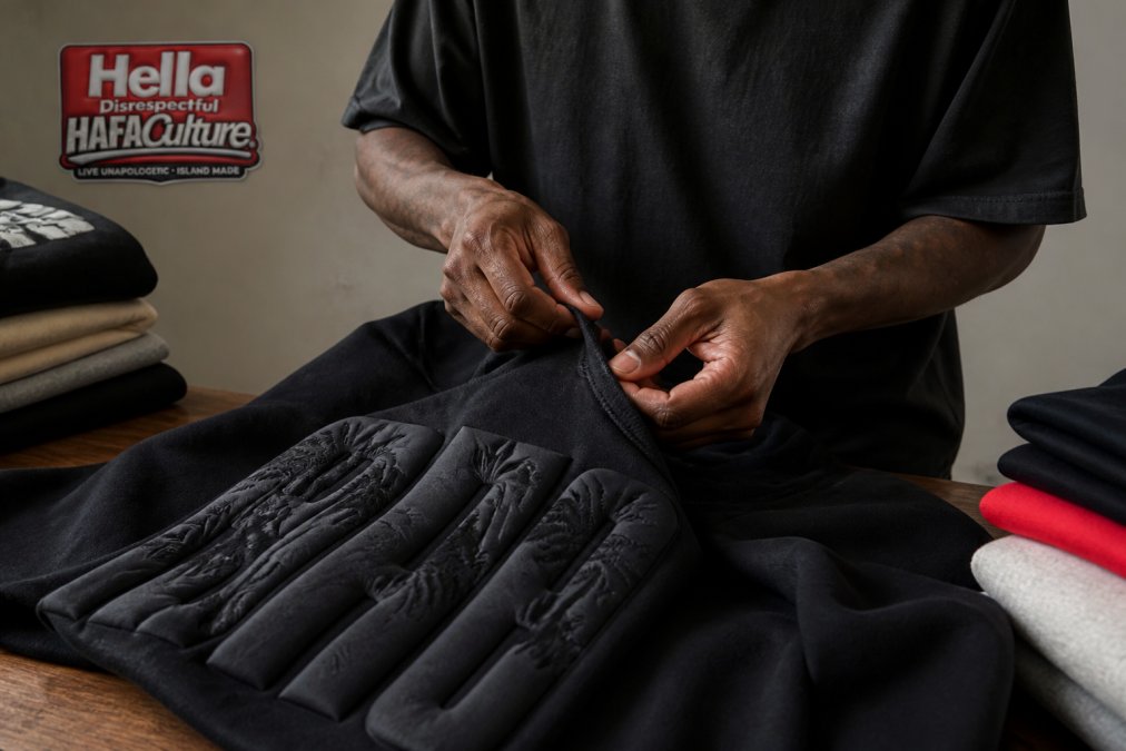
Run a finger across the graphic. DTF has a softer, flexible hand feel and reproduces photographic detail and full-color blends. Puff print rises off the surface and casts a small shadow, reading as premium from a distance.
| Method | Texture | Best For | Detail Level | Dark-Garment Behavior |
|---|---|---|---|---|
| Screen print | Flat, matte, slight edge | Solid colors, slogans, bulk runs | Low to medium | Excellent with underbase |
| DTF | Soft, flexible, smooth | Full-color art, gradients, small runs | High | Strong, no underbase needed |
| DTG | Ink-in-fabric, weightless | Photo-real, small runs, light garments | High | Weaker; fades faster on darks |
| Puff print | Raised, dimensional | Logos, seals, statement back prints | Medium | Excellent; catches light |
Design Scalability: The Step Most Guides Skip
A bold graphic that looks perfect on a 6 oz. tee can fall apart on a 12 oz. hoodie or a structured cap. Pressure-test artwork against the garment it will live on:
- Fleece absorbs ink differently. A hoodie's brushed interior and heavier face mean the same screen deposit reads slightly duller. Bold colorways often need a heavier ink laydown or a higher-contrast palette to hold up.
- Small surfaces kill fine detail. A design with 1 pt. linework that reads clean on a back print will clog and blur on a 3-inch chest hit or a hat front. Simplify the mark for small placements.
- Stretch changes the print. Knit tees flex; a stiff, thick print cracks along fold lines. If the design will sit on a stretchy garment, favor a thinner deposit or a flexible ink.
- Scale the hierarchy, not just the size. When you shrink a graphic, the hero element needs to stay roughly twice the visual weight of the secondary elements. Shrinking everything proportionally is what makes small placements look cluttered.
Identifying Authentic Streetwear Quality in Person
Quality shows up in details you can check in ten seconds. Flip the garment inside out: clean, dense stitching with no loose threads signals real production control. Then check the neckline, a ribbed collar that springs back holds its shape; one that stays stretched out won't survive a month.
Hella Disrespectful Snapback →
Streetwear Graphic Design Trends 2026: What to Watch
Most trend roundups tell you what is hot. The more useful skill is knowing how a trend forms, so you can spot the next one before it hits the mass market. Streetwear graphic design trends in 2026 lean toward texture and cultural specificity over logo repetition, the framework below lets you read the shift yourself.
A Trend-Forecasting Framework You Can Run
Trends move through a predictable pipeline, and each stage gives a different signal:
- Subculture origin. A look starts inside a specific scene, a skate crew, a regional music movement, a niche sport, a diaspora community. At this stage it's raw, inconsistent, and mostly offline.
- Independent adoption. Small labels pick it up and refine it into a repeatable visual language. This is your leading indicator. Watch what independent drops ship first.
- Editorial and resale lift. The look starts showing up in lookbooks, on resale platforms, and in styling content. Prices on early pieces climb.
- Mass-market copy. Fast-fashion and big-box brands reproduce a simplified version six to twelve months after stage two. By the time it's everywhere, the bold version is already dated.
Three Shifts Defining 2026
First, dimensional print techniques: raised puff prints and layered textures are replacing flat one-color hits because they photograph well and feel premium in hand. Second, hyper-local and heritage references: designs speaking to a specific community or lineage rather than a generic "urban" mood. Third, minimalist-to-maximalist contrast within a single piece, where a clean front gives way to an oversized back graphic.
From Trend to Bold Graphic: The Translation Step
A trend only becomes a bold design when it survives three filters:
- Legibility at distance. Squint from fifteen feet. If the trend reference disappears into noise, it's decoration, not design.
- Production fit.
- Scalability across the line. The strongest trend-driven graphics work as a back print, a chest hit, and an accessory mark without redrawing. If it only works at one size, it's a one-off, not a direction.
Why Specificity Beats Novelty
The trends that last are tied to a real place, community, or history. A graphic referencing something specific reads as authentic even after the trend cycle moves on; one that samples a mood reads as generic the moment the mood passes.
Cultural Influences and Subculture Signals in Bold Design
Bold streetwear design is a visual language with roots. Skate culture gave it abrasion and utility. Hip-hop gave it scale and name-brand confidence. Graffiti gave it wild style lettering and the idea that a tag is a signature.
Conclusion
Spotting a bold streetwear design that works comes down to reading hierarchy, texture, and cultural intent, not volume. Most pieces fail because they shout without a focal point or print that cracks after three washes.
Frequently Asked Questions
What are the key characteristics of bold streetwear design?
Bold streetwear design combines oversized silhouettes, high-contrast color palettes, and typography that commands attention. Look for graphics that use strong visual hierarchy, meaning the main message reads first and supporting elements guide the eye. Print method matters too. Puff prints and direct-to-film each create different textures that change how a design reads in person. The best bold designs balance statement impact with wearable proportions so the piece works as everyday street style, not just a costume.
How can you tell if a streetwear design is high quality?
Check three things: print durability, fabric weight, and construction details. A quality print stays sharp after repeated washing, with no cracking or fading at the edges. Fabric should feel substantial, not thin or see-through. Look at the neckline, seams, and hem for even stitching and clean finishes. When identifying authentic streetwear quality, also inspect how the graphic sits on the garment. If it feels stiff, misaligned, or peels at the corners, the print method or application was rushed.
How do color palettes influence the impact of streetwear graphics?
Color controls where the eye lands first. High-contrast combinations like black and white or neon on dark backgrounds create immediate statement impact. Muted or tonal palettes feel more understated and often signal a minimalist vs maximalist design choice. For bold streetwear, the most effective palettes use two to three colors maximum so the graphic stays readable from a distance. Too many competing colors flatten the visual hierarchy and make the design feel noisy rather than intentional.
How do you distinguish between mass-produced and unique streetwear designs?
Mass-produced graphics tend to repeat safe formulas: centered logos, generic fonts, and stock imagery. Unique designs show creative direction that ties to a specific subculture, region, or story. Look for custom typography, original illustration, and graphic placement that breaks from the standard chest-center print. Limited drops and small-batch production also signal authenticity. If the same design appears on dozens of unrelated products across multiple storefronts, it was likely pulled from a print-on-demand catalog rather than designed for a fashion label.